FIRST POSTER DRAFT

I began the first draft of my post by thinking about what themes I wanted to convey to those who see it. I wanted to put the viewer on edge to show the thriller and horror themes been shown but also to make sure the military theme also is clear. I felt the combination of Joe(actor) wearing the skull mask along with the night vision goggles(NVG) help convey both the intensity of thriller and horror with the military themes. The skull is off-putting as is conveys death as well as hides the identity of the wear, all whilst the viewer is being directly stared at. The NVG's also make it clear of the military themes due to them being recognisable specialist equipment.
SECOND POSTER DRAFT

The second draft is where I started experimenting with the use of subtle colour and how I could use it to draw the audience in. The main splash now has bright colours in use, the sunglass and the glare from the night vision goggle's red light. These small uses of colour are very effective at drawing attention due to the lack of colour in the rest of the poster, this will bring the audience's attention to the main characters and emphasize their importance. This was also where I added the billing block text at the bottom to give the post a professional look, as well as the age rating. I also experimented with the idea of having the logo being held up by the creature's hands, but for the next draft, I chose not to use at I felt it distracted from the main splash and looked out of place.
THIRD POSTER DRAFT

For the third draft I began looking at the placement for other text around the poster, I contemplated having the cast spread out across the top area of the poster but I felt it took up too much of the top area's space. It would also take space away from other text I was yet to add. I also began looking at how to draw attention to the film logo. I felt that using a silhouette of the creature would be an effective play on words as well as contrast with the white text, grabbing the viewer's attention.
FOURTH POSTER DRAFT
In this draft, I did some minor tweaks to the image behind the logo, lowered its capacity to give it a ghostly appearance and also added motion blur to make it look as if it is moving. Almost falling. I also moved the cast text around to fit in the production logo. The use of the logo is important to establish a sense of branding so that audiences know and identify with the team behind the film. I also added pull quotes around the edges to make the audience feel as if the film's quality has been validated and highlighting the strong words to add impact.
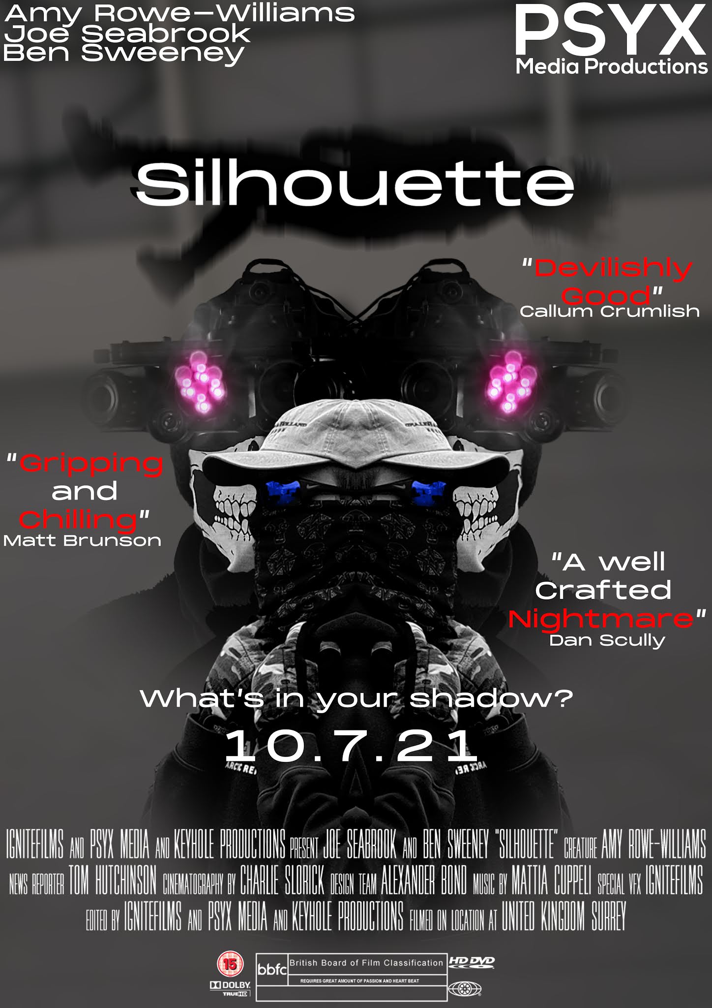
FINAL EDIT

In my final edit I made some small adjustments to the previous draft. Primarily the logo was made large along with the background image, to draw attention. The names of the reviewers were removed to make the poster look less cluttered and it removed unnecessary information. Also the gutter now featured the social media @'s.
Sophisticated reflective analysis with sustained insightful comments about how you developed your poster design, fully supported with visual evidence. Highly sophisticated technical skills using Photoshop (layers, colour, layout, motion blur, text) at a high standard resulting in an excellent design finish. Your analysis reflects confident understanding of poster genre conventions and how you considered both the branding of your product and the expectations of your audience. Well done.
ReplyDelete