Thursday 8 April 2021

WELCOME MODERATOR


CHARLIE SLORICK
CANDIDATE NUMBER: 1770
CLAREMONT FAN COURT SCHOOL 64680

My Production Team: Thomas Hutchinson 1733, Alexander Wain 1779 and Myself

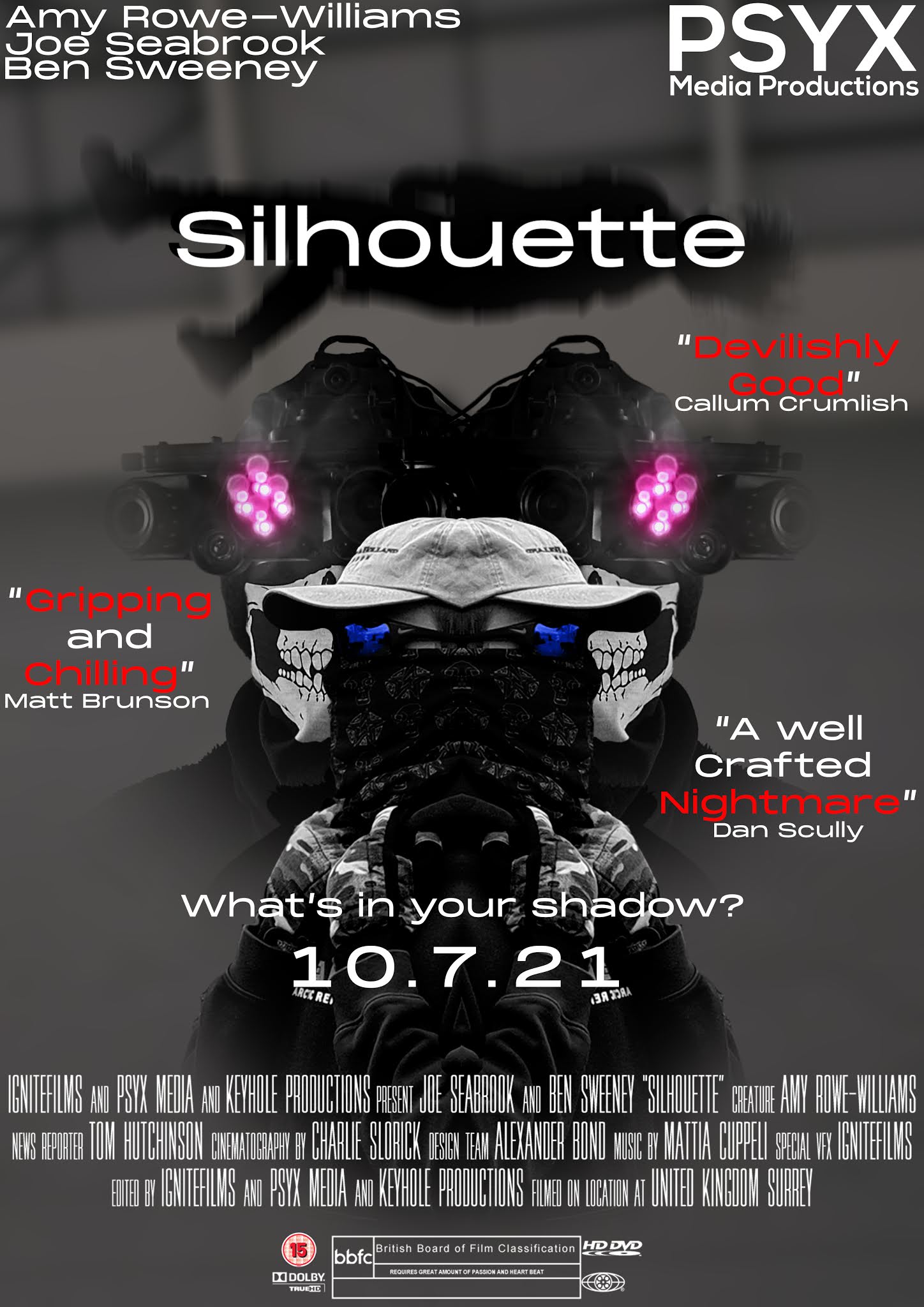
Our brief was to produce a promo package for a film. This included two trailers (teaser and 2 minutes), a poster and a website all promoting the same film. We went with a thriller/horror/action as our genres, we wanted to experiment with these themes as we had never used them before and were eager to see what directions it would lead us. The title of our film is Silhouette. To create an effective promo pack we needed to research as well as plan the components of our promo pack. This can be seen uploaded to my blog. For the production of our promo pack, we used Adobe Premiere Pro, After Effects and Photoshop to effectively craft media that looked professional. Social media was also used for the distribution of film/promo pack, these social media included Instagram, Twitter and YouTube. Making the promo pack look professional and real.

EDITING

Tom took up the mantel of the primary editor for our trailer, though we all chipped in from time to time, showing effects we thought would work as well as giving Tom suggestions. Tom was the ideal editor for us as a group, he had the most experience with Premiere Pro and After Effects. As well as a reliable person for the edit as we were all pleased with his editing for our previous production Duty Calls. Tom used his technical knowledge and understanding of codes and conventions to produce a trailer with slick effects and gripping imagery to engage the audience. 

DIRECTING

For directing we all took up this role. We felt if we all had an input on the directing of our film it would improve the quality with diverse ideas as well as produce a trailer that we were all happy with. Tom would offer his insight of what the scenes should look like together and how we could have different scene connect as well as stand out to make some information appear more important. I gave the other insight on what camera techniques could be used to convey some meaning or in tandem with Tom, discuss camera/actor movements that could flow into transitions. 

CAMERAWORK

I was excited to return as the director of cinematography for this production as I had managed to borrow a Fujifilm XT-2 camera from a good friend. This camera was a high-quality mirrorless camera that could record footage in high-quality 4k resolution, on top of this a top-notch colour quality. Using this specialist equipment allowed me to capture footage that looked professional as well as eye-catching, with vivid colours and sharp detail. I made sure to get the most out of this camera by using a wide range of techniques to convey our themes and genres. Dolly shots, low angle, worm shots, bird's eye view, close up, pans, follow pans and many more. To both utilize the camera to provide captivating shots as well as give Tom flexibility with the editing. 

POSTER

TRAILER


TEASER TRAILER


WEBSITE

Thursday 1 April 2021

CONSTRUCTION: SOCIAL MEDIA

To engage our target audience, who are ages 15+ and would frequent social media sites, we created social media pages on numerous sites. This would allow the audience to actively interact with the media. These pages would provide frequent updates around the production of the film as well as the information around the film's release, this would keep the audience's interest in the film while they are unable to access it. 

INSTAGRAM - LINK

TWITTER - LINK


Wednesday 24 March 2021

REFLECTION: DESIGNING THE FILM WEBSITE

Wix.com was used for the construction of my film website. Wix is an easy to use services that provide sleek and aesthetic wireframes that the user can edit to make their own. It also offers a multitude of features that are of great use for a film website, such as an integrated store function as well as hyperlinking with a wide range of assets. 
I began the design of my website with a black and white theme in mind, which then evolved into having hints of red for assets to grab attention. I made sure that all the assets fit within the two sidebar lines. This is to make sure that a wide range of screen sizes can see important assets. 
Wix allows for the use of galleries which is used here. You can select from a range of layout for the images to appear in, I used the masonry layout for my gallery. This give each photo a roughly equal scale so more photos are able to be shown. The gallery is useful in a film website as it allows the audience to see behind the scene photos or other media around the film, getting them invested and hyped for the film. 

The contact page features three logos of social medias. When clicked on, the logos are linked to their respective social media and takes the user to the account of the film/production company on those social medias. The email address is able to be highlighted, copied and pasted if the user wishes to get in contact. 
On the screenings page, each text asset of the name of the festival is hyperlinked to take the user to the festival's home website when clicked on. This creates an easy to use interface and allows the user to book tickets to the festival without having to search for it. 

Tuesday 23 March 2021

REFINEMENTS: FILM POSTER

FIRST POSTER DRAFT

I began the first draft of my post by thinking about what themes I wanted to convey to those who see it. I wanted to put the viewer on edge to show the thriller and horror themes been shown but also to make sure the military theme also is clear. I felt the combination of Joe(actor) wearing the skull mask along with the night vision goggles(NVG) help convey both the intensity of thriller and horror with the military themes. The skull is off-putting as is conveys death as well as hides the identity of the wear, all whilst the viewer is being directly stared at. The NVG's also make it clear of the military themes due to them being recognisable specialist equipment.

SECOND POSTER DRAFT

The second draft is where I started experimenting with the use of subtle colour and how I could use it to draw the audience in. The main splash now has bright colours in use, the sunglass and the glare from the night vision goggle's red light. These small uses of colour are very effective at drawing attention due to the lack of colour in the rest of the poster, this will bring the audience's attention to the main characters and emphasize their importance. This was also where I added the billing block text at the bottom to give the post a professional look, as well as the age rating. I also experimented with the idea of having the logo being held up by the creature's hands, but for the next draft, I chose not to use at I felt it distracted from the main splash and looked out of place. 

THIRD POSTER DRAFT

For the third draft I began looking at the placement for other text around the poster, I contemplated having the cast spread out across the top area of the poster but I felt it took up too much of the top area's space. It would also take space away from other text I was yet to add. I also began looking at how to draw attention to the film logo. I felt that using a silhouette of the creature would be an effective play on words as well as contrast with the white text, grabbing the viewer's attention. 

FOURTH POSTER DRAFT
In this draft, I did some minor tweaks to the image behind the logo, lowered its capacity to give it a ghostly appearance and also added motion blur to make it look as if it is moving. Almost falling. I also moved the cast text around to fit in the production logo. The use of the logo is important to establish a sense of branding so that audiences know and identify with the team behind the film. I also added pull quotes around the edges to make the audience feel as if the film's quality has been validated and highlighting the strong words to add impact. 

FINAL EDIT

In my final edit I made some small adjustments to the previous draft. Primarily the logo was made large along with the background image, to draw attention. The names of the reviewers were removed to make the poster look less cluttered and it removed unnecessary information. Also the gutter now featured the social media @'s. 

Monday 22 March 2021

CHANGES: COLOUR CORRECTION AND STABILISATION

BEFORE
Here in this footage Ben is running down a sloped surface, for this shoot the fijifilm camera was unavailable due to lockdown limitations this meant the scene was filmed using my phone. This proved difficult in keeping the footage stable.  

AFTER

To combat the camera shaking a stabilisation effect was used in Premiere Pro. This is where the editing software analyses the footage and warps and crops it to stabilise, making the footage move smoothly. Also here a colour correction tool in Premiere was used to alter the colour of the footage to convey a meaning or improve the overall look of the footage. 

Sunday 21 March 2021

EDITS: TRAILER EDITING

 TRAILER EDITING PROCESS

We began the editing process by looking at the video clip we could use and thought about how we could use them to link to one another, creating a timeline of events. As well as this, we looked to our storyboard to remind us the direction the trailer should take. This proved difficult as due to the complications caused by the pandemic there was a great deal of clips we had wanted to be filmed from our storyboards that weren't able to filmed. So we focused on the timeline we had just made by looking out our clips. 

Here we had begun experimenting with sound. The soundtrack had to be the first thing put onto the Premiere project as the clips would need to fit with it's tone and tempo. Otherwise it would feel disconnected.  

For special effects, Tom used the After Effects application. In this screenshot, a 3d map of the footage is being made so that objects can be grafted onto the building. The red circle is where the centre point of the 3d map is. This 3d map allows virtual depth to made for image and other assists to placed onto. This virtual depth makes the objects look real and apart of the original footage. 

Here we are applied to Ultra Key effect in Premiere to remove the background of the news clip. With the background removed, we placed the clip on top of the image of the tv. An image of the newsroom was also placed behind the clip. This constructed a realistic scene where it appears as if the audience is looking at the news from within a living room. 

To give our trailer a professional look we used colour grading to set the colour tones and the overall appearance of the footage. The colour grade setting we used was called SL IRON HDR. It gave the footage a slight blue wash and well and darkened other colours. Giving the trailer an intense atmosphere as well as a sharp look. 

Music is used to convey the intensity of the thriller and horror genres that are being used in the trailer, while also adding impact to the visuals of the trailer. The music swelling is used in tandem with the intense scenes to make for an atmosphere that will have the audience on the edge of their seat. 

TEASER TRAILER EDITING PROCESS

The teaser trailer has the task of engaging the audience within 30 seconds, this means that our teaser would need to present engaging components quickly and efficiently. In Premiere, we built up the timeline using short cinematic clips that convey the themes of the film as well as providing spectacle to grab the audience's attention. Intertitles are also utilities to build tension and give a small insight into the film's plot. These intertitles were timed to match with the heartbeats to add impact and tension. These heartbeats were used to give the teaser a consistent tension and build up.  


Sunday 20 December 2020

CONSTRUCTION: GREENSCREEN AND VOICE RECORDINGS

We were interested in the idea of using a news broadcast as a way to give the audience an insight into the story. This news read would only suggest what is happening to motivate the audience to keep watching. We experimented with the use of a green screen to create a digital newsroom from which a news anchor reports. 

For the green screen to work properly, there were several precautions we had to take to ensure the best quality. The subject/actor was positioned at a distance away from the wall, as well as the camera. This was done so that the camera focal point could be set on the subject and the brick pattern on the green screen would be less visible. As well as this, the subject has positioned a distance in front of the green screen to prevent spill. Spill is where the green colour from a green screen "spills" onto the subject. This can result in the subject having a green glow, as well as areas being removed by the editing software. Also to ensure that the editing software (Adobe Premiere Pro) would effectively remove the green screen, two sets of lights were shone onto the background to keep the colour bright and vivid. This would mean it would be easier for the editing software to distinguish the green colour that needs to be removed. 
In this photo, the lights are being set up to ensure that they are lighting the background and not the subject/actor (Tom). Also in this photo, you can see the distance between the subject and the green screen. 
Audio quality is an important part of a good film if the audio does not match the footage, or the quality is poor it can turn away audiences and break your sense of immersion. In the photo, the microphones are being set up. This is to record what the actor says in good quality. This was done because the camera we were using was far away from the actor, meaning the audience would not be able to hear him. If we were to increase the volume of the camera's mic, it would result in unwanted sounds become more prevalent (e.g. footsteps or white noise). After the filming was done, we did another voice recording where the actor spoke directly into the microphone. This was so that we could have a high-quality recording that could be used as a voice-over in different parts of the trailer. 
Here in Premiere Pro, we used the ultra key effect to remove the background (green screen). This will allow us to place anything we want behind the actor, which will be a newsroom. As well as this we used the crop tool to remove the microphone's boom arm that was protruding into the shot. On top of this, we also had to sync the voice recording captured by the microphone with the video. This was done by having the actor(s) clap, and we would use this clap to pinpoint the position the audio need to be. 

Thursday 3 December 2020

CONSTRUCTION: SECOND FILMING SHOOT

Once we had established where we planned to film next, we were eager to begin. The filming location was a secluded area of our school's grounds that featured thick woodlands and abandoned belvedere. We felt this would be an excellent area for our project and play well into our theme of a supernatural thriller. A few days before filming with the actors, Tom Alex and I scoped out the area and I took some establishing shots of the area. These were great for adding tension as the area was shrouded in fog at the time. Unfortunately on the day, we filmed with Ben there was no fog. This was not an issue though as our project is a trailer, continuity is not required between shots. Although we did talk about how the drastic change in appears the filming location had between filming shoots could be implemented into the supernatural elements of our film. 

These two photos show a great difference in the filming location between the two filming dates.

This was one of the establishing shots that I recorded during our brief exploration of the filming location. The thick veil of fog brings out a sense that this area is isolated and I think that idea will help keep the audience on the edge of their seat. 

This is an over-the-shoulder shot that I took of Ben moving around the building. This technique was used to make the audience feel as if they are entering this uncharted territory with the character and produce a sense of dread of what is around the corner. Then Ben steps further away from the camera showing his swift and efficient movement as he traverses the area, emphasising the specialist military themes of our project.

This clip is an edit of the previous video. I like how the over-the-shoulder technique brought into the scene and made you feel as if you there with the protagonist. To get a stronger grasp of how the footage would look, I put the clip into Premiere Pro and tested out how I wanted the footage to look like. It was also a chance to see if the stabilization effect in Premiere Pro would be effective. As well as this I experimented with the idea of cropping the footage to create cinematic bars to tightly fix the audience's attention on the point of focus. 

Once we had gathered all the footage we needed around the building, we looked around our schools ground to see if anything else would be of use to us. In the photo, we found a stretching brick wall and felt it would be an effective tool to use with a dolly shot as the straight lines of the bricks would help convey a sense of movement and tell the audience that character is moving across a location.

In this clip, we have Ben traversing through the low ground and past a brick wall. The bricks moving past on the right create a sense of movement emphasise a greater meaning behind this character's journey to a location. As well as this, the gun is pointed towards the audience presents the character in a position of power. This will be used to contrast with scenes where the character struggles against the antagonist. 

After this set of filming, we had created a large library of video clips that will be used in numerous way to produce our ideal trailer. 

Friday 27 November 2020

RESEARCH: CINEMATIC STORYTELLING

The book "Cinematic Storytelling" outlines the different uses of smash cuts with examples from renowned film Psycho and American Beauty. In American Beauty, a smash cut jumps from a wide aerial shot to an imposing close-up, jolting the audience. Psycho uses a moving shot than then slam to a stop with a static shot, making the audience feel as if they have ground to a halt. 
There are numerous ways in which we could use this technique, one idea we discussed would be the following the protagonists travel in a car to the warehouse (the camera follows the car as it thunders done the road). A still shot of the warehouse suddenly appears. 

Another technique the book highlights, climate. Climate can be used to convey a specific meaning to the audience without having to make it too obvious. The example used is Shyamalan's "The Sixth Sense", coldness is used to symbolize the unnatural (ghosts). Clouds of air (mist) are used to tell the audience that character has indeed died but remains in the land of the living. 

We could use this technique of using the scene's climate to connote meaning. A drop of blood or strong gust of wind could be used to connote a death to the audience without directly showing it to them. This could envoke a stronger emotional investment from the audience as they do not see who has died or if anyone has died, this will motivate them to watch the film.